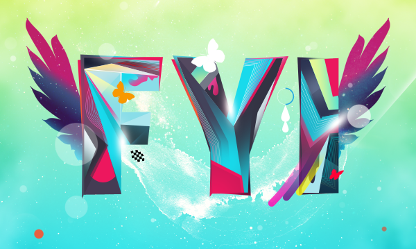
 This tutorial shows creating a beautiful and vivid, typography based artwork. You will learn to combine different elements and applications effectively to complete a design task.
Preview of Final Results
Download the PSD
How to Create a Colorful Text Design in Photoshop
Resources
Step 1 : Creating and Tweaking the Text
First We need to prepare the text to work with. Open up Illustrator. Type in the letters. Choose a bold typeface. I used Futura Extra Bold Condensed.
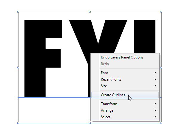
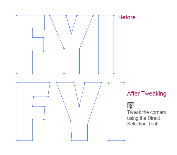
Ok, now the text is in. We are not going to use as it is. We need to give it a little personal touch by tweaking the letters. We have to break the text in order to edit it. Right click on the text and choose "Create Outlines" or PressCtrl+Shift+O to create outlines of the text. Now ungroup the text by hitting Ctrl+Shift+U. Tweak the edges using Direct Selection Tool.
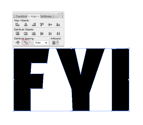
Use the Align Palette to distribute the distance between letters equally.
Step 2 : Creating the Document and Bringing the Text
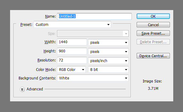
Before we start designing, we need to plan out the requirements
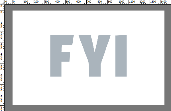
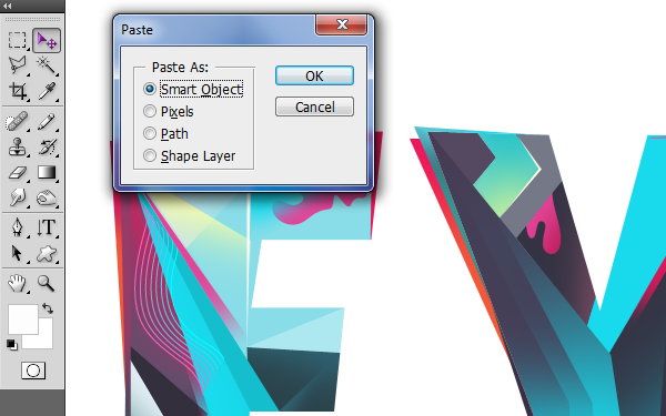
Copy and Paste the text from Illustrator. Choose Shape Layer option when pasting.
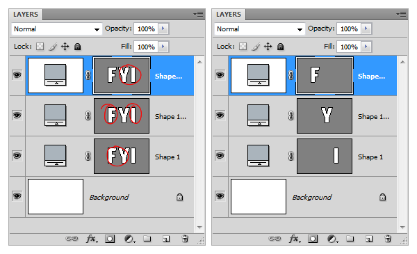
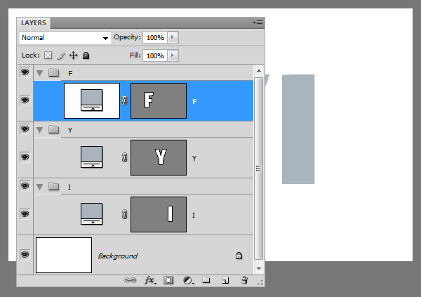
Now we need to separate the letters. To do this duplicate the main shape layer a couple of times. Select the Path Selection Tool, select the letters we don't need from each layer and delete them.
Create 3 groups to contain the letters.
Step 3 : Line Work and Creating Pieces.
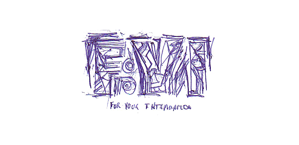
I have done a sketch of the design according to my idea. Not very detailed, it is actually a thumbnail sketch but it gave me the start I was looking for. Ideas often tend to be abstract, surreal and partly defined. Sketching is a great way to improve the perception of ideas.
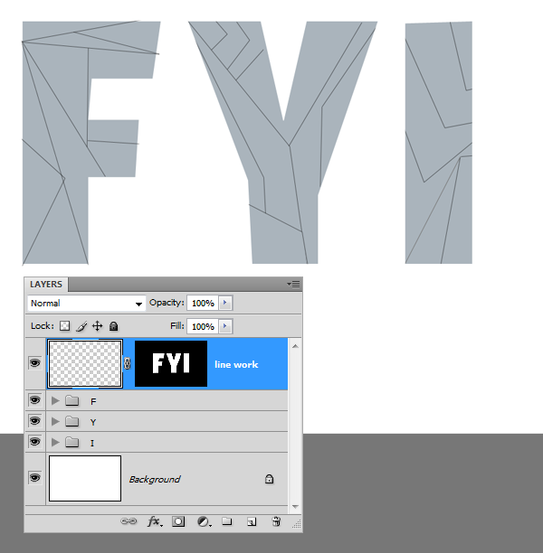
Create a new layer above the letters. Based on the idea from initial thumbnail sketch I have constructed the text outlines. Use the Line Tool to create the lines. The idea is to fill the segments with lot colors and values.
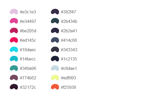
Here is a sample color palette that I picked. This is just to give you an idea, however you are not forced to use the exact same values it depends on your taste and intuition. But this is more or less what I have used in this design.
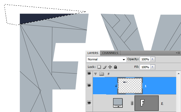
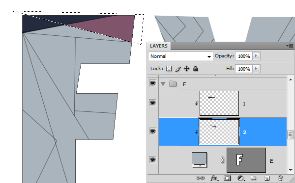
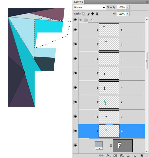
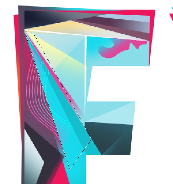
We have the line work made. We need to fill in the colors between the lines. Create a new layer above the "F"layer. Then Clip this layer to the letter (Ctrl+Alt+G). Make selection for each segment using the Polygonal Lasso Tool and fill the color.
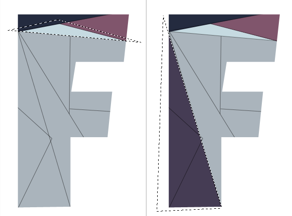
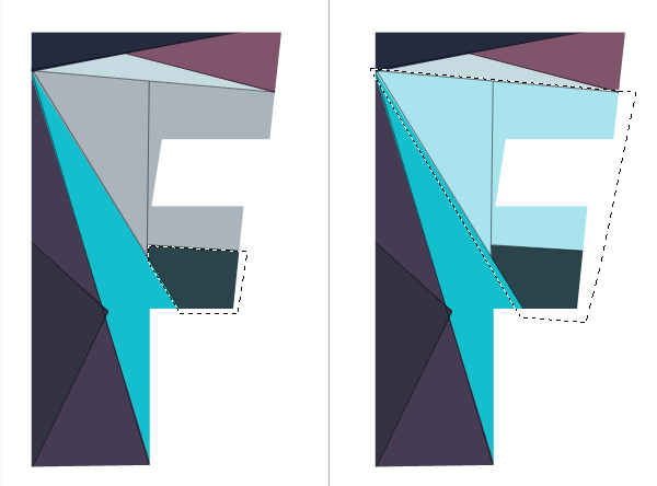
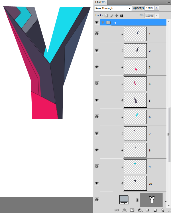
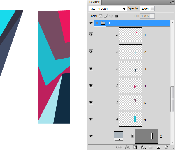
Repeat the process. This is going to be a two fold process. First time we need to get every single segment filled and have them on separate layers. Then we work around each character and make them more vivid and bright. A thing about layer order, Don't get confused with so many layers. Proceed with it anyway that makes sense to you and as long as it works.
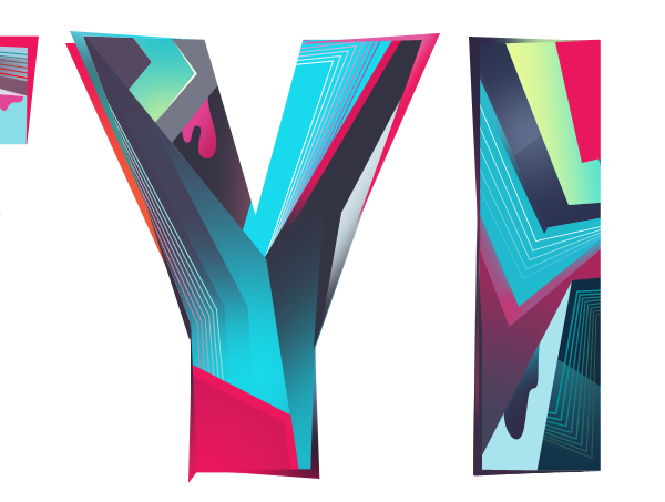
Repeat the process to complete the remaining letters.
Step 4 : Adding More Details and Colors
Here we have the solid color version of the design. Let's see what we can to improve it.
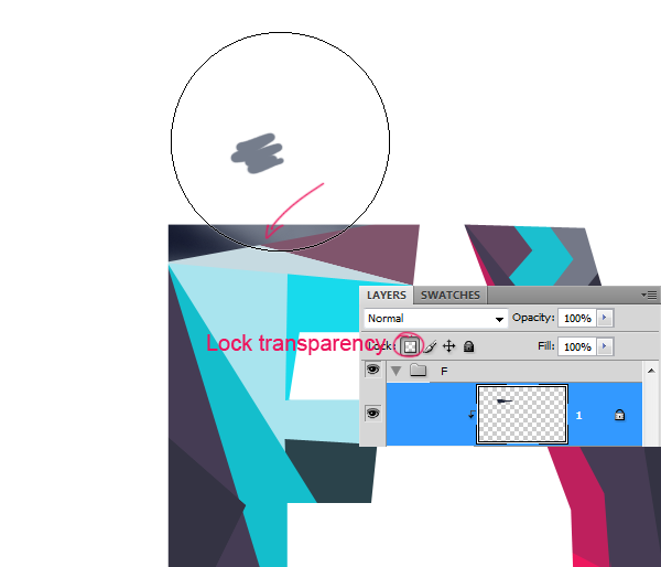
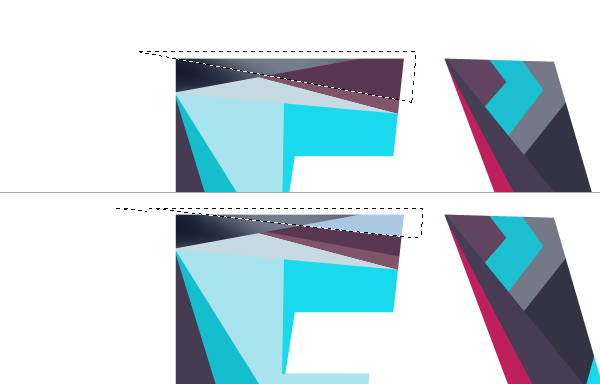
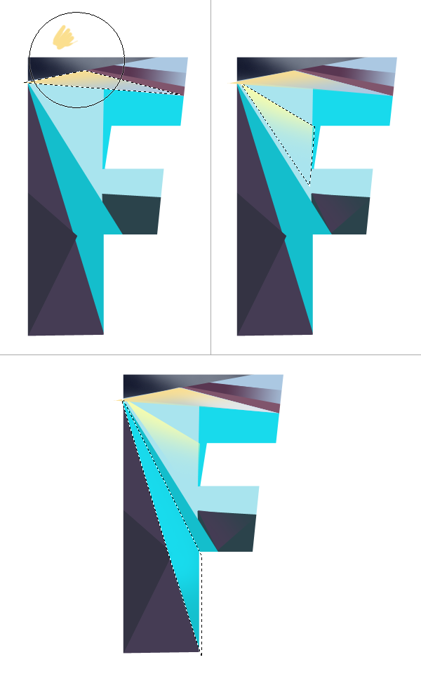
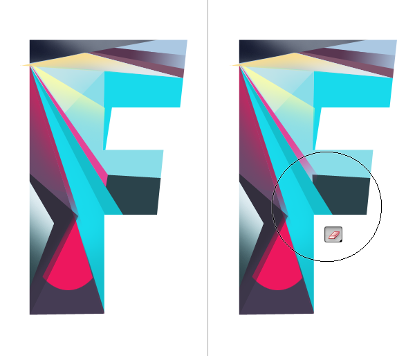
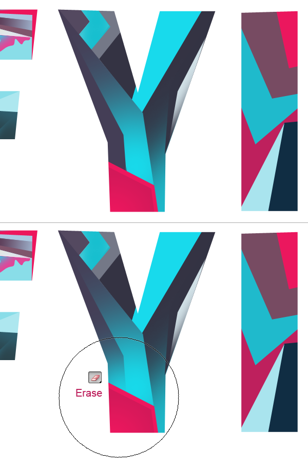
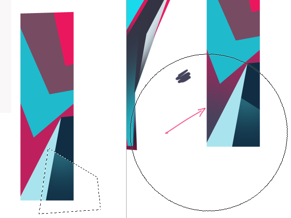
We will apply different shades to the pieces. We can do this using the Brush Tool and isolating the transparent pixels of the layer. Check the Lock Transparent Pixels option on the Layers palette. This will limit the brush strokes to the existing pixels.
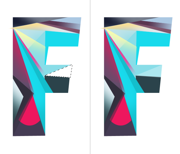
Then I added some more segments.
Lock the transparency and apply color.
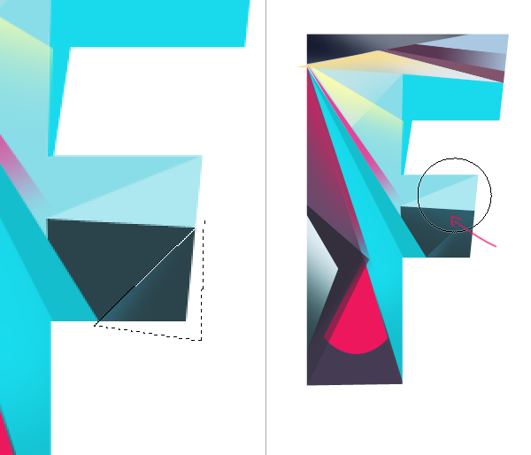
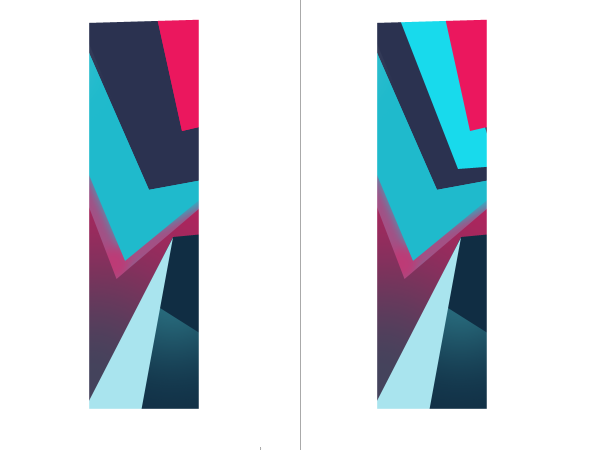
As you can see this time I made a selection to apply color in a new layer despite using the existing layer below. But it will add some extra layers. However There is no definite way to go about this. The whole process is intuitive than a set of predefined steps. Basically we are adding darker and lighter tones to give depth to the letters.
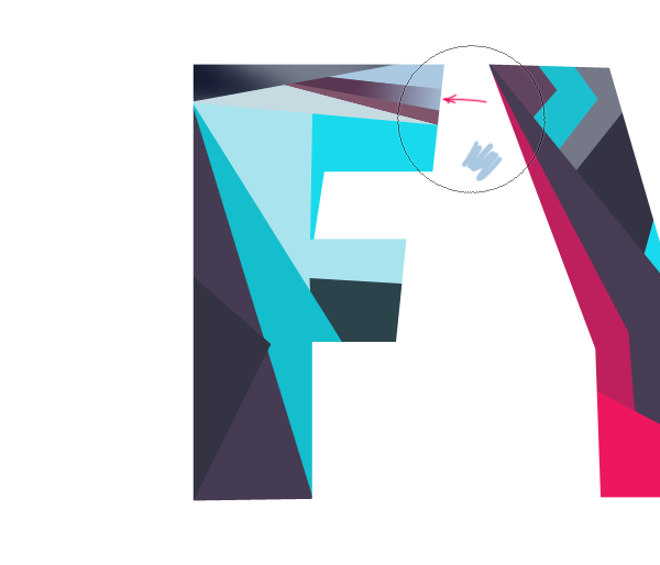
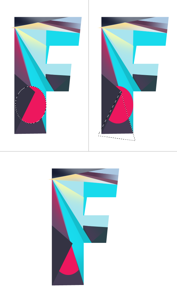
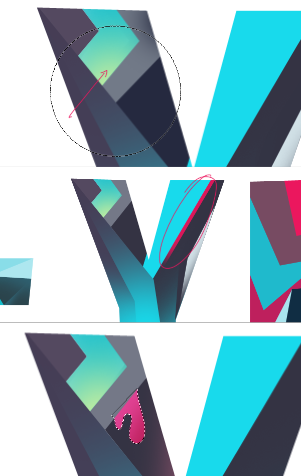
Adding some interesting shapes. Here I drew an oval, filled with a nice pink and deleted the portion I don't want.
Continue to add more details
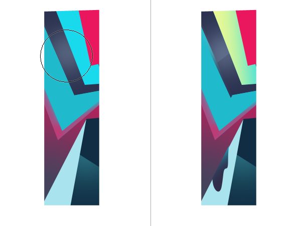
Use Pen Tool to create similar shape.
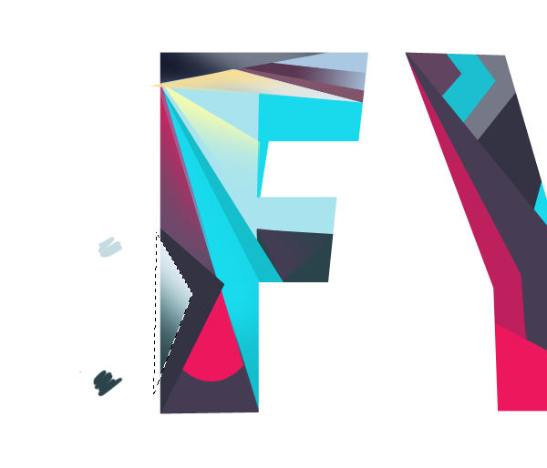
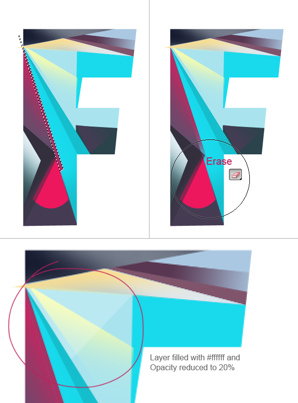
Here I added sharp highlight filled with white.
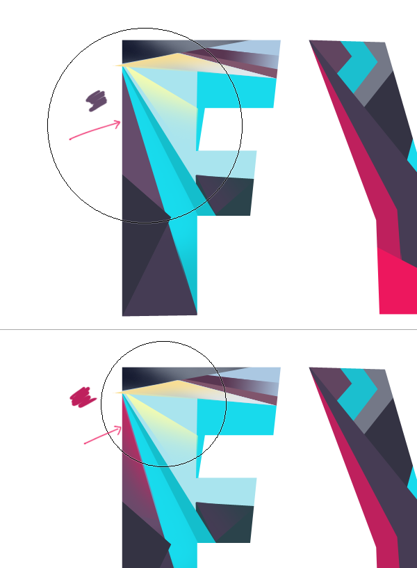
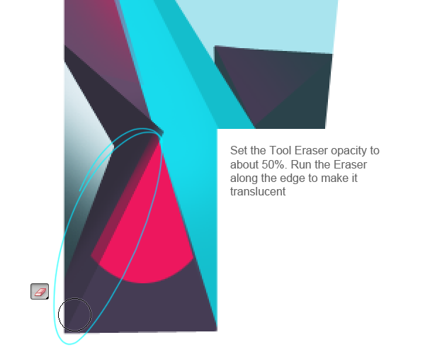
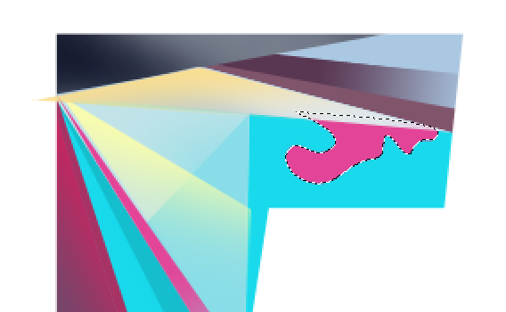
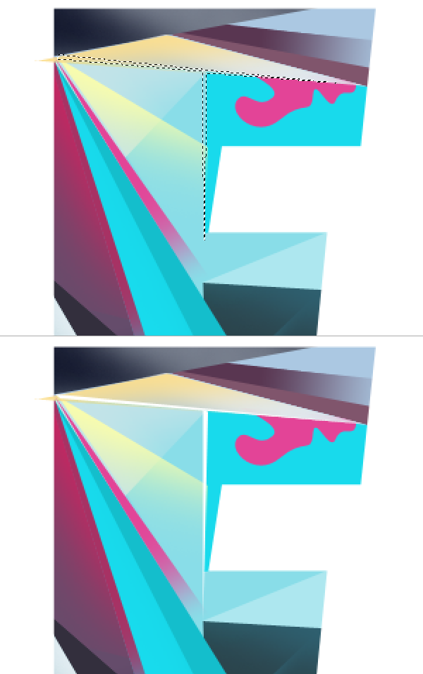
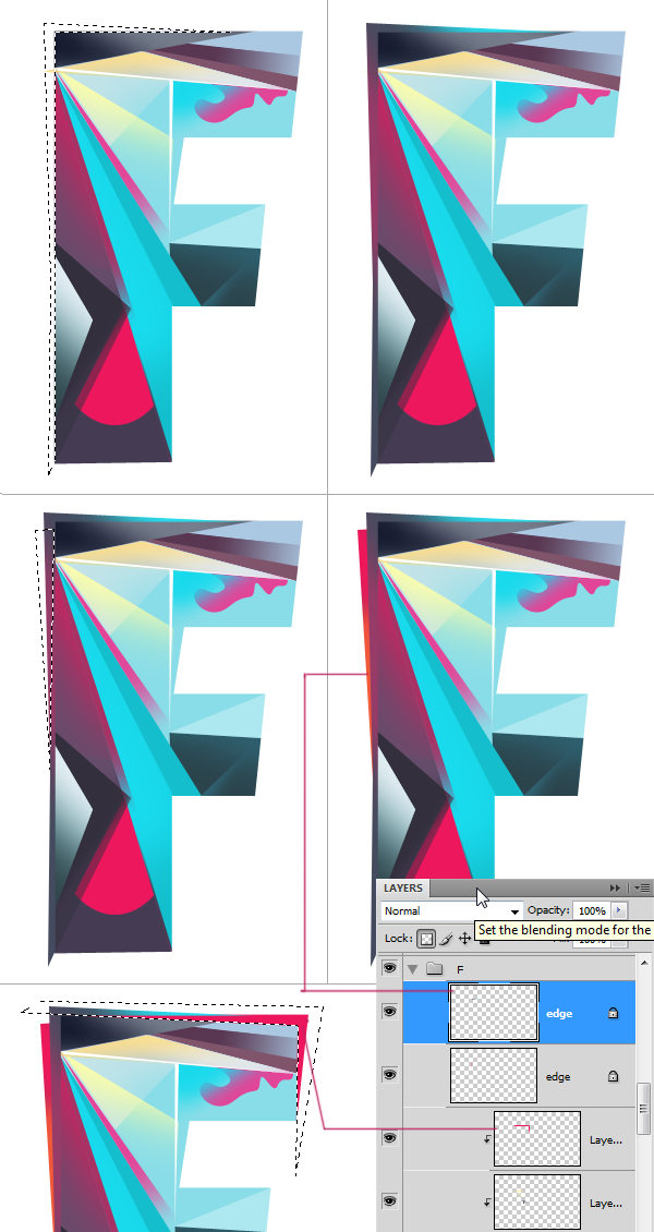
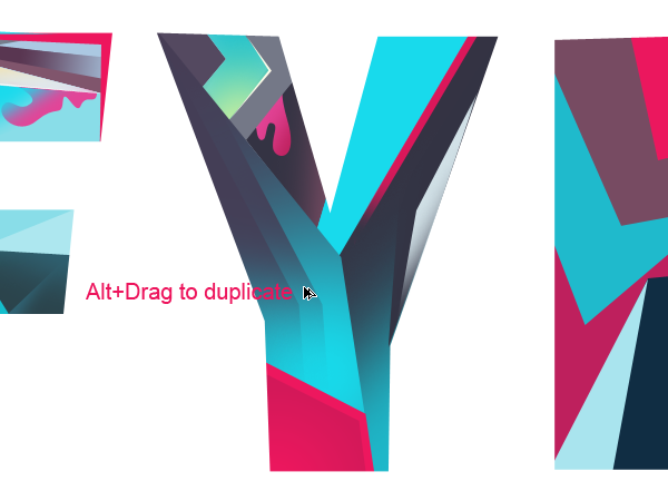
Now we have pretty much completed the first letter. But the letter shape is still too defined. We need to induce some randomness that will give character to it. Make a selection on the edge and fill it with solid color. Don't make a perfect selection keep it a bit irregular. Lock the transparency of the layer and add more shades. Keep these layers out of the clipped stack.
Let's move on the next letter in order.
Page 3 of 4
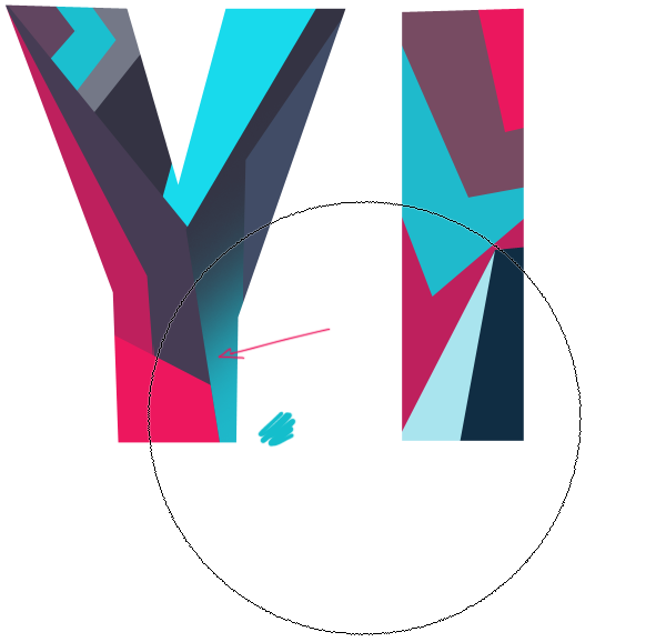
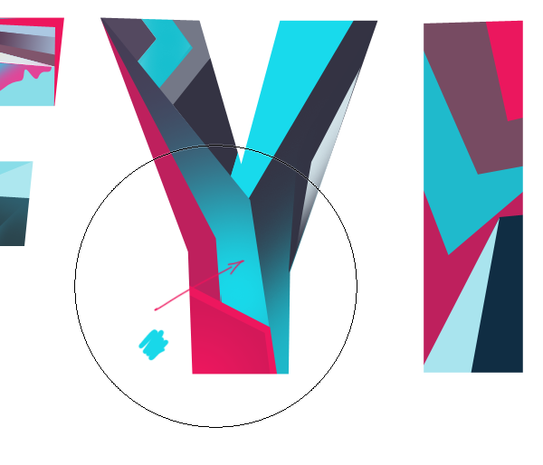
Here I recolored the piece which I wasn't satisfied with. Lock the transparency and press Alt+Backspace to fill the color.
More shades and details.
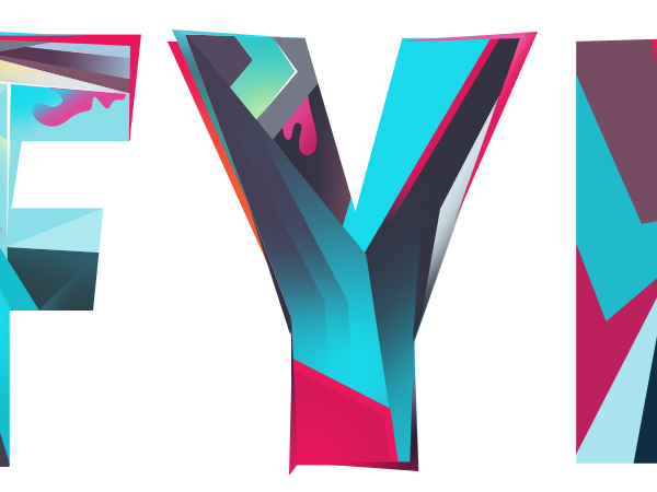
Work on the Edges.
Let's finish the final letter.
Step 5 : Creating Vector Line Work
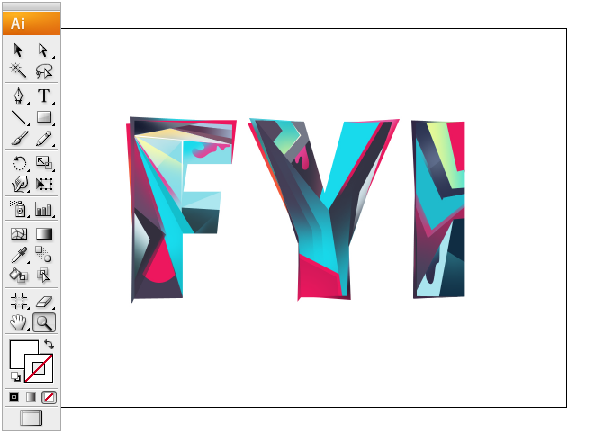
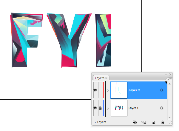
That's fine so far. The text is perfectly made up. Now we can add some line work to it using Illustrator. To do this save a copy of our image as JPEG. Open it in Illustrator. Lock the image layer in the Layers palette. Crete a New layer above the image.
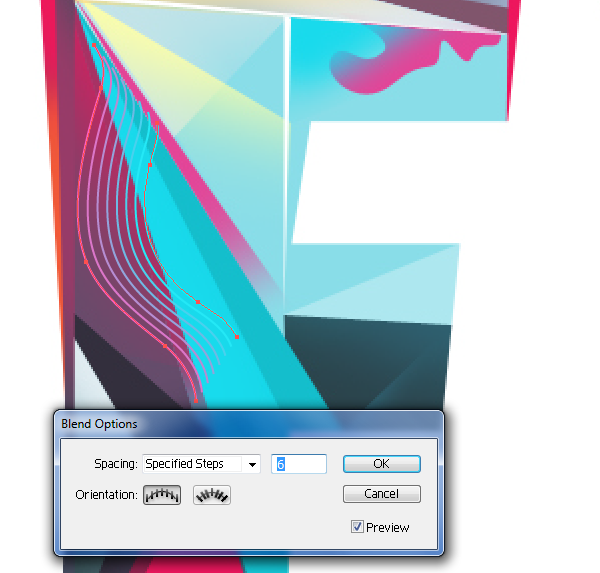
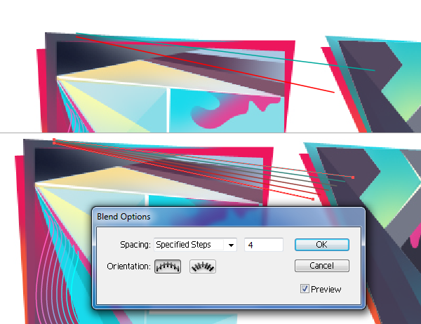
Now create the blends. Use Pen Tool to draw the lines. Pick different colors for each of the lines that will give a nice transformation between the two colors. Select the lines and hit Ctrl+Alt+B to create blend. To edit the blend settings, double click on the blend tool. Pick any color that looks good.
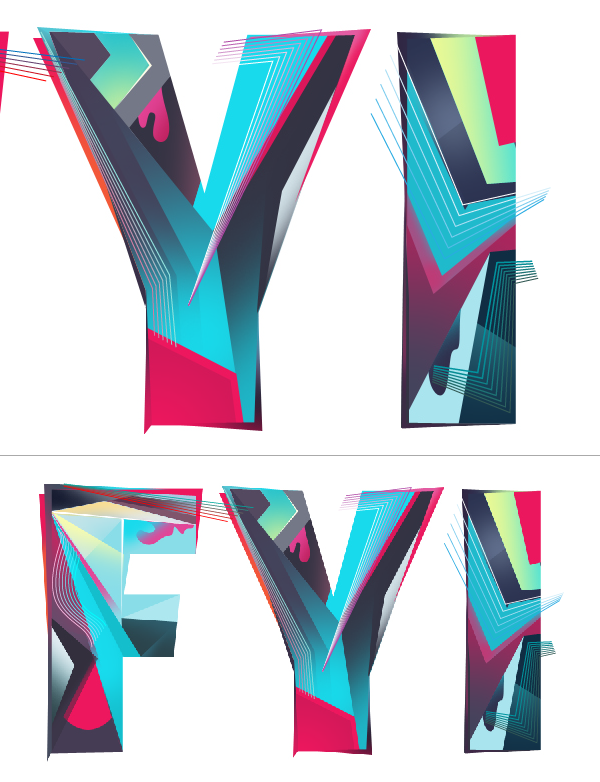
Create blends for the remaining letters.
We now need to take the blends into Photoshop. Copy and paste each piece separately as Smart Objects.
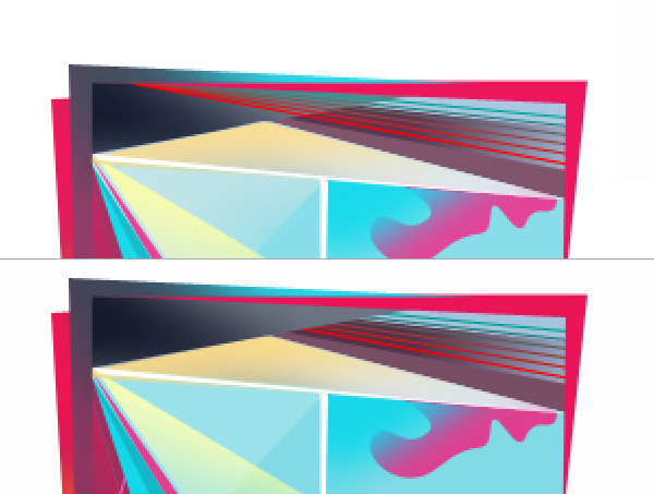
To hide any part add layer mask select the area and fill the selection with black.
Or place it in the clipping stack below the layer that is supposed to be on top.
Bring in rest of the blend objects. that finishes the text part.
Step 6 : Bakcground
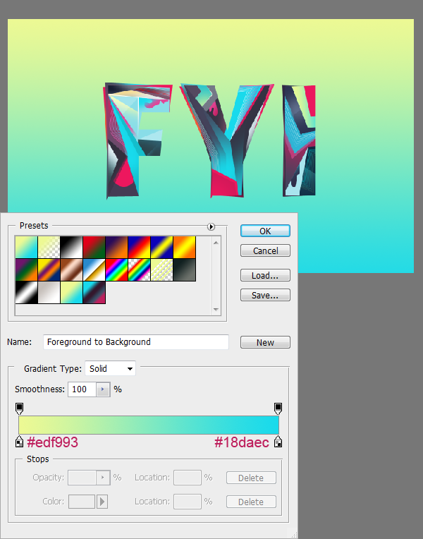
Create a new layer below the text and fill the gradient using Gradient Tool.
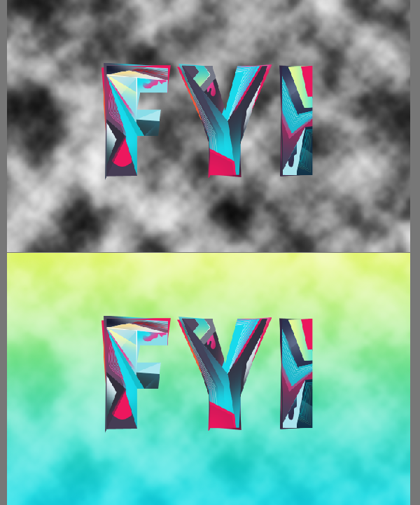
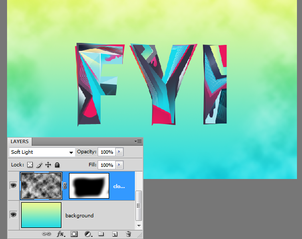
Create a new layer above the background and choose Filter > Render > Clouds. Press 'D' key before applying the filter to reset the colors to default. Change the blend mode to "Soft light".
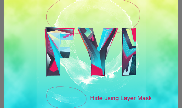
I don't like the clouds to appear all over. Hide the clouds at the center using Layer Mask.
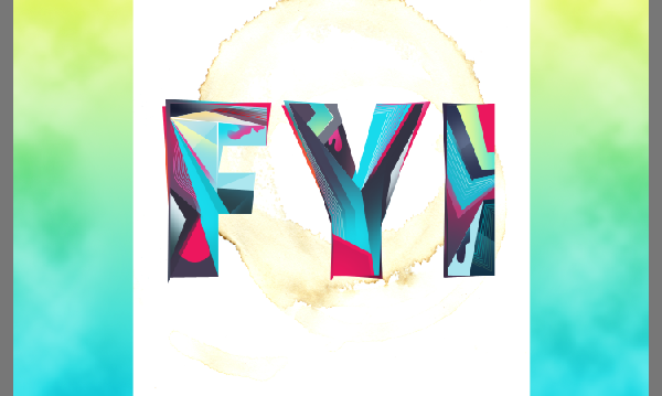
Drop in the coffee stain image (1.JPEG in the pack). Place it below the Text.
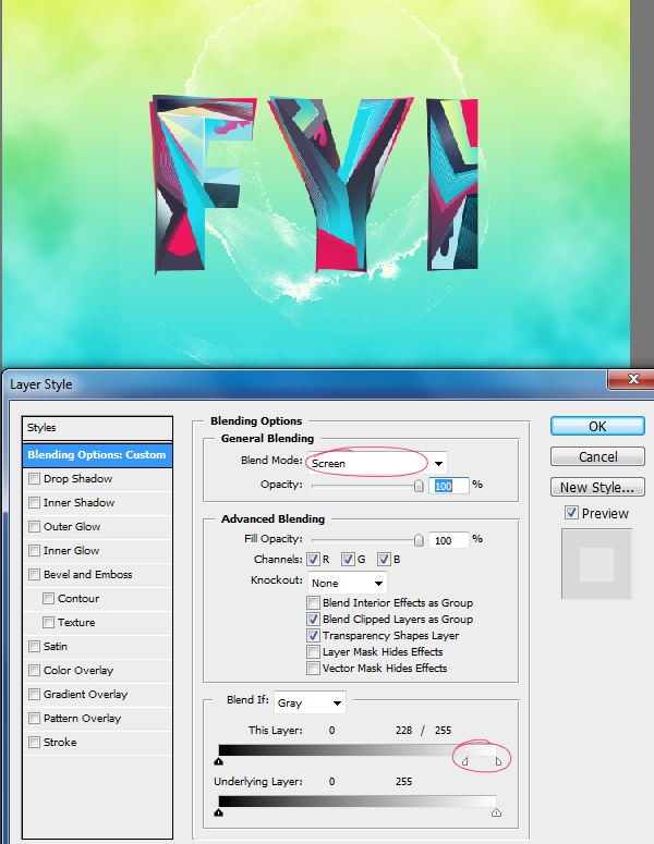
Now double click on the layer thumbnail. This will present you the Layer Style box. First change the blend mode to "Screen" On the same box you will find "Blend If" section. This is where all is going to happen. We have two Blend sliders there we can adjust. We need to adjust the "This Layer" slider. Hold the "Alt" key, click on the white color handle and drag it away from the edge. This will blend the texture into the background nicely.
Duplicate the layer if the result is not strong enough. Mask out unwanted any areas.
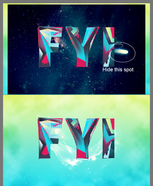
Drop in the nebula stock image. Place it above the coffee stain texture. There is a big white spot in the image. Hide it using Layer Mask. Then change the blend mode to "Screen".
Step 7 : Adding More Elements
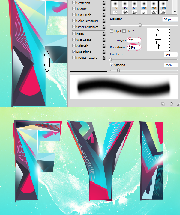
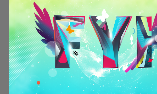
Add some glowing highlights to the text using the Brush Tool. Create a new layer above the text and use brush tool to add the highlights. Modify the brush width and angle in the Brushes palette.
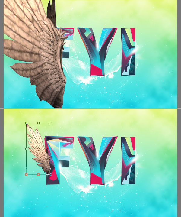
Let's spice up the composition quickly by adding wings to the text. Drop in the wing stock image. Resize and reposition it.
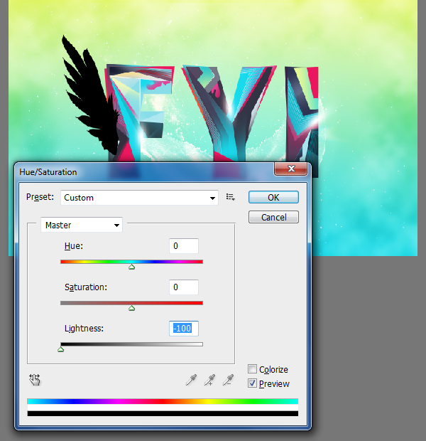
We don't need any color information in the wing. We need only the form of the wing. So press
Ctrl+U to open the Hue/Saturation box. Bring down the lightness all the way to -100.
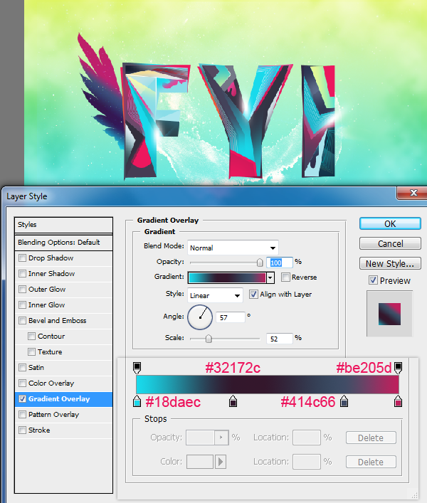
Apply Gradient using the Layer Styles box. You may use the below settings.
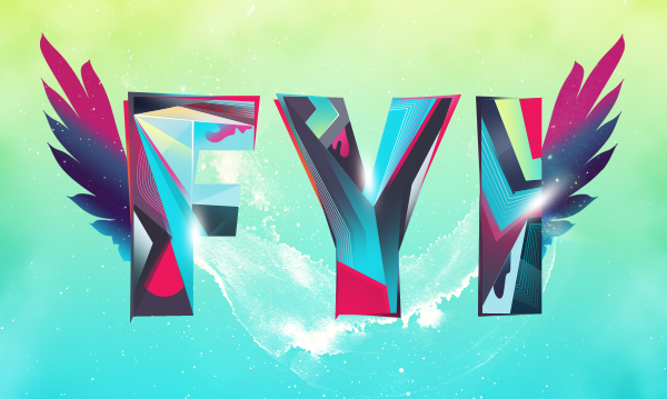
Duplicate the wing and flip it horizontally. Before flipping it you need to merge down the effect, create a blank layer above the duplicated wing and select both layers, hit
Ctrl+E.
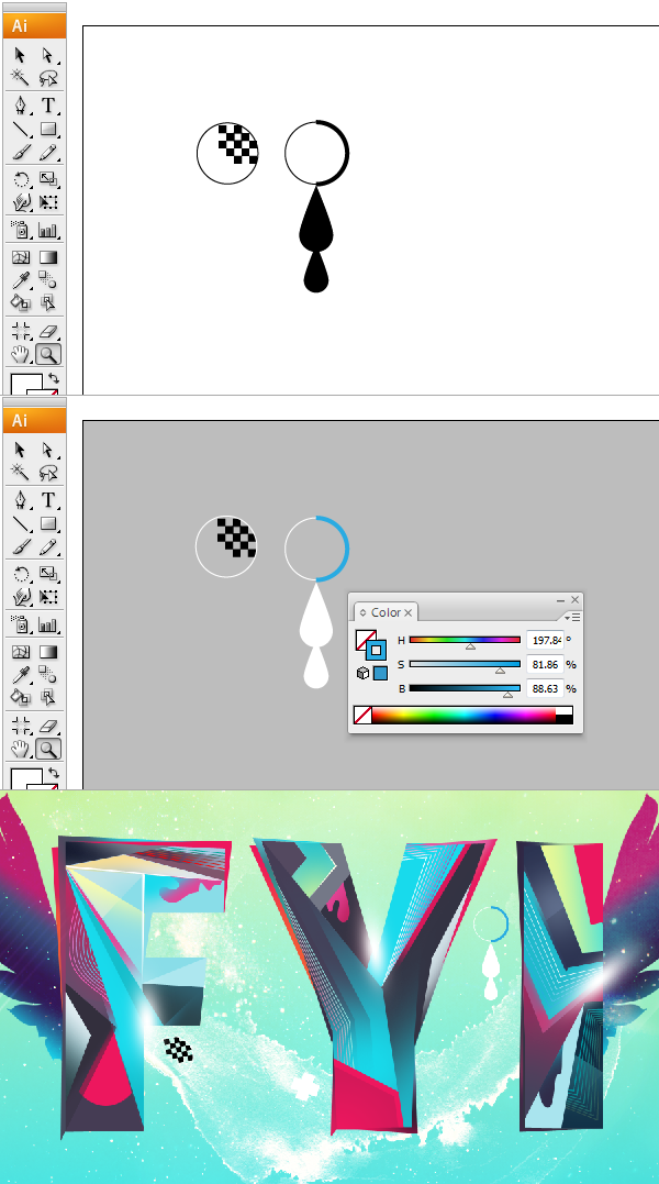
We have little more work in Illustrator. Most of the time I prefer to create my own design elements rather than using brushes. This will give the work some character and signature. Here I created two simple elements in Illustrator. Then I recolored them.
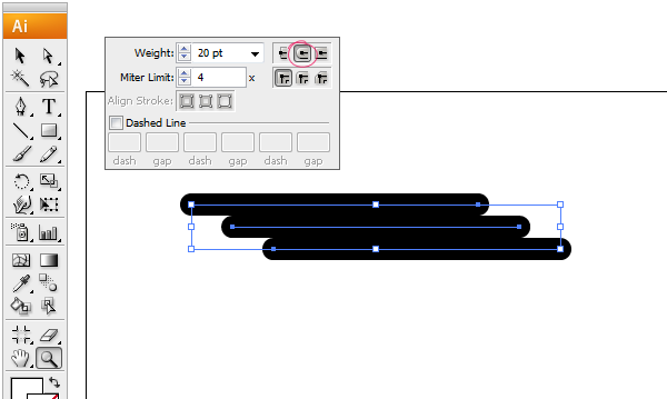
Now we are going to create a brush in illustrator. Use the Line Tool to create the lines. Set the stroke weight to 20 points. Stack them in the below manner with no gap between the lines.
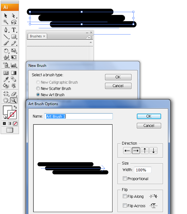
Open the Brushes Palette (F5). Select all the lines and drag them into the palette. In the subsequent dialogue box choose New Art Brush and press Ok. This will give you Brush Option box and confirm it to finish the process.
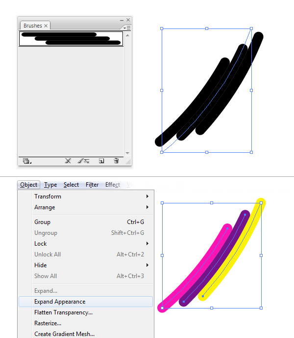
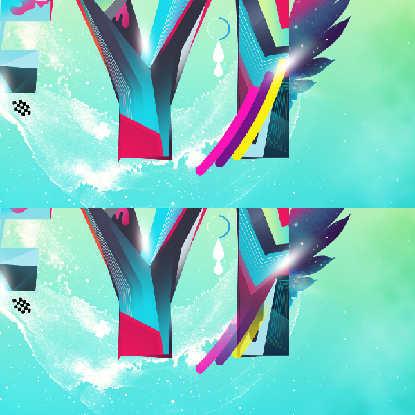
Let's put our brush to use. Create a curve using the Pen Tool. Select the line and apply our new brush to it. That's fine. Now expand the stroke, choose Object>Expand Appearance. Now the strokes are separated, ungroup them. Recolor them using the Colors palette.
Bring it as Smart Object. Here I place it above "I". Then mixed it smoothly using mask.
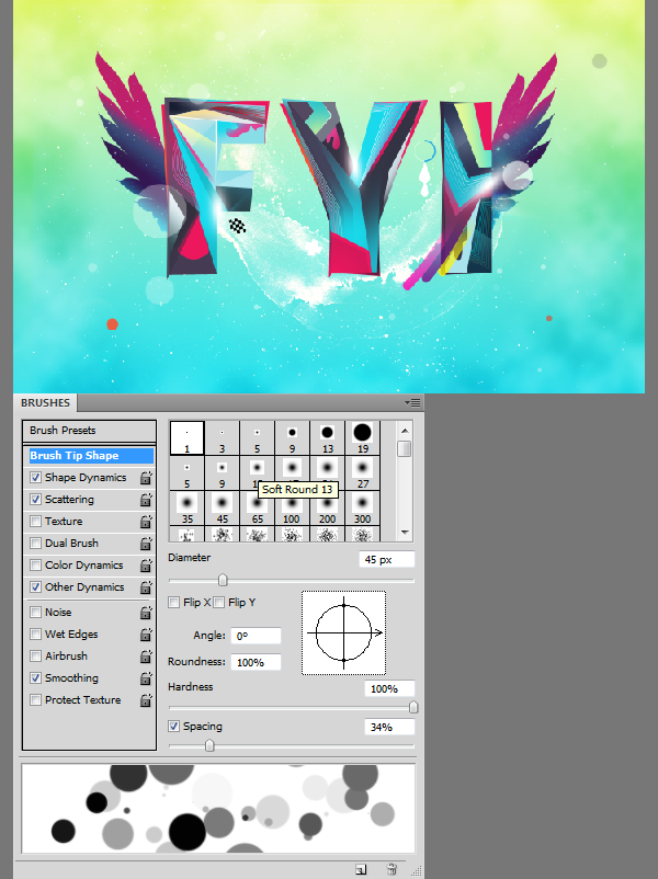
Give the composition a bit more extra depth. Pick the round brush with 100% hardness. Play with Scattering and Color Dynamics settings. And spray some particles. Keep it minimal and subtle.
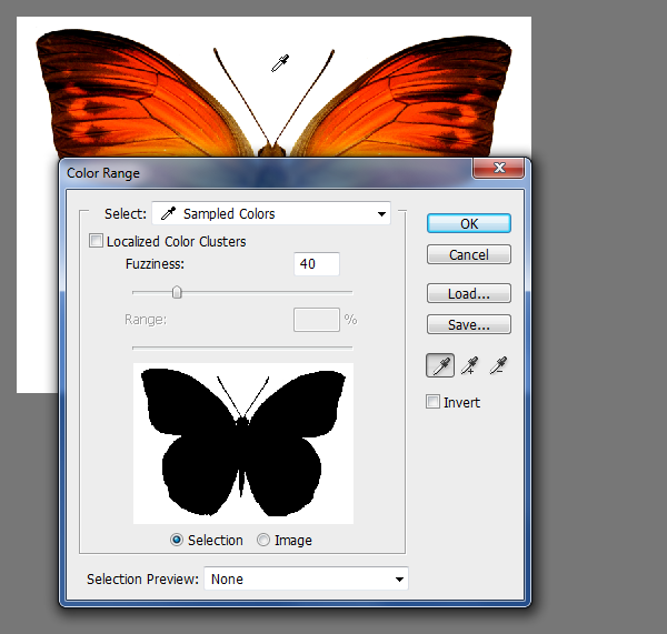
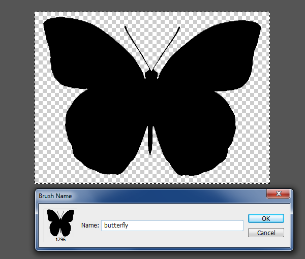
Now create a custom butterfly brush. As I mentioned earlier this will give it a personal touch. First load the butterfly stock image into Photoshop. Isolate the butterfly from the background using Color Range command. Go to Select>Color Range. Pick the background color to make a selection.
You need to invert the selection (
Ctrl+Shift+I) because we selected the background not the butterfly. Then press
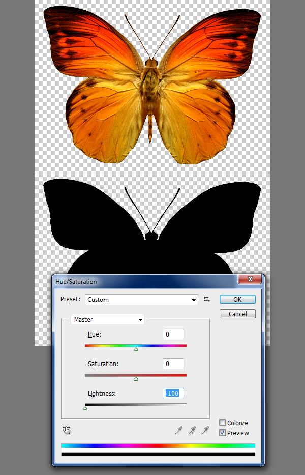
Ctrl+J (Layer via copy). Now we have the butterfly isolated. Turn off the background layer. Load Hue/Saturation box and remove the lightness.
Make selection using Marquee Tool. Go to Edit>Define Brush Preset. Click Ok to confirm.
Let's put the brush to use.
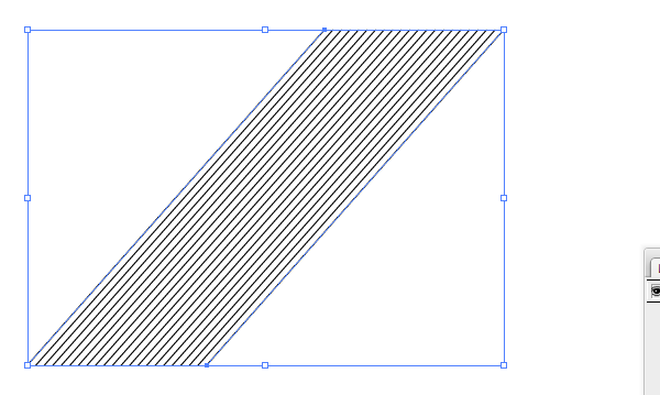
Switch back to Illustrator for the last time. Create some simple lines using the Blend Tool. Change the stroke color to white. Copy and paste into Photoshop.
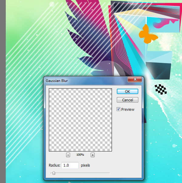
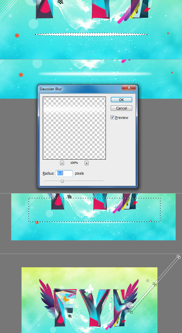
After you reposition it right click on the layer and choose Rasterize Layer option to rasterize the layer. Apply a little Gaussian Blur.
Blend smoothly.
Create a light streak. Follow the picture below.
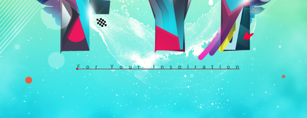
Add text.
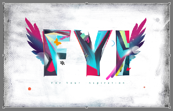
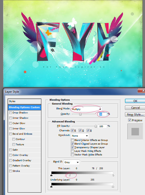
Bring in the paint texture (aqueous_sun_textures_v2_031.JPEG). Rotate it and resize to cover the entire canvas. Perform all the transformations in one shot. Otherwise you will lose the sharpness.
Double click on the thumbnail of the layer, Adjust these settings.
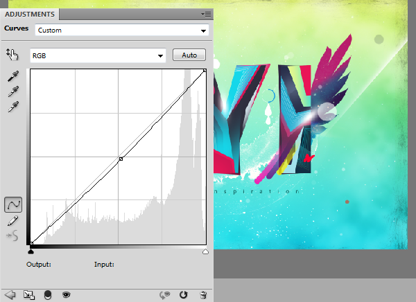
Add Curves adjustment layer above all layers.
And for the final touch I have added lightning effect to the composition purely for aesthetical purpose using Alien Skin Xenofex plug-in. However it is not free plug-in. If you have it then you can use it or else omit this step. Now that finishes this tutorial.
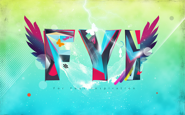
Preview of Final Results





![final-results[1] final-results[1]](http://photoshoptutorials.ws/images/stories/136a58e3e040_DC3/final-results1.png)
Keine Kommentare:
Kommentar veröffentlichen