
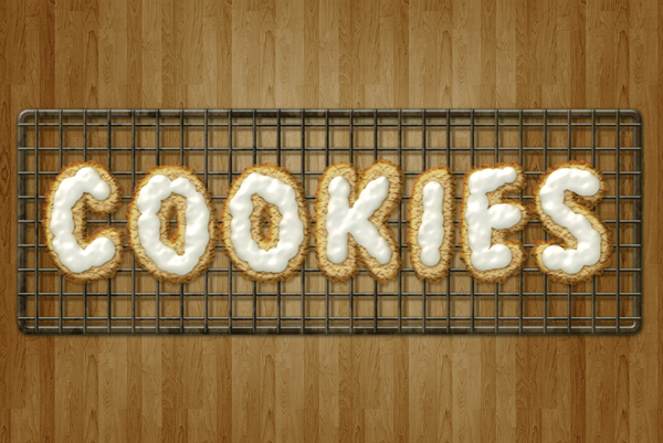
This tutorial will explain how to create delicious frosted cookies text effect. You'll learn some useful tips for using layer styles, filters, and brushes while creating the various elements of the "cookies".
Preview of Final Result
Download the PSD
Create Delicious Cookie Text Using Photoshop
Resources
Step 1
Download the
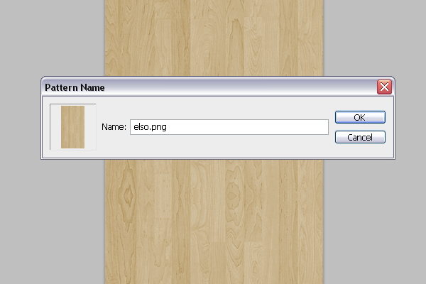
8 wooden patterns and open the "elso.png" image in Photoshop. Go to
Edit -> Define Pattern, and type in any name you want for the pattern.
Go to
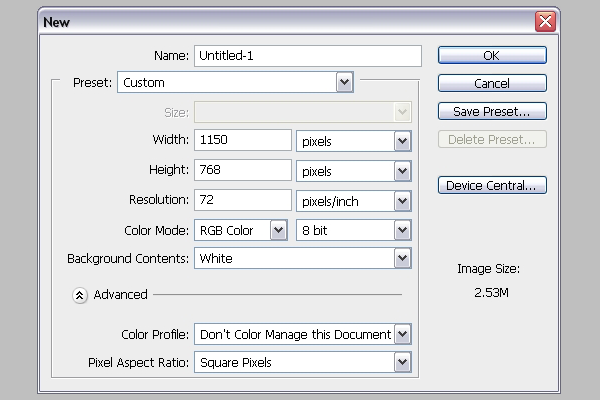
File -> New, and create a new 1150 x 768 px document.
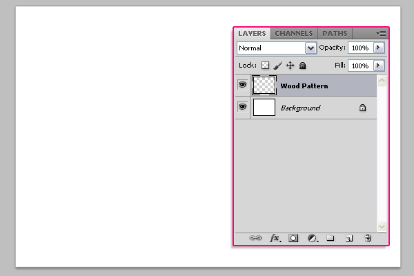
Create a new layer on top of the Background layer and call it "Wood Pattern".
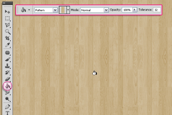
Pick the
Paint Bucket Tool, and in the Options Bar at the top, choose
Pattern for the Fill type, and choose the wood pattern from the patterns drop down menu. Then fill the document with the selected pattern.
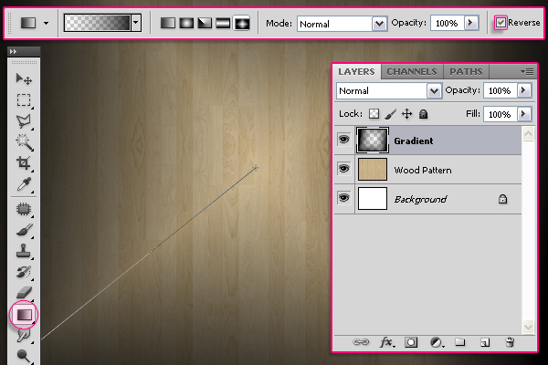
Create a new layer on top of the "Wood Pattern" layer and call it "Gradient". Pick the
Gradient Tool, set the Foreground color to
Black, and in the Options Bar, choose the
Diamond "Foreground to Transparent" gradient, and check the
Revers box. Click and drag from the center of the document to one of the corners to create the gradient.
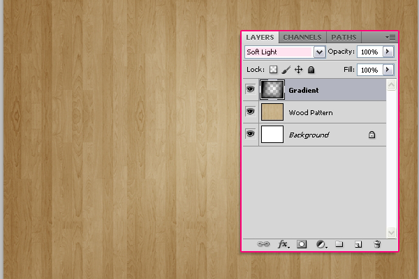
Change the "Gradient" layer's
Blend Mode to
Soft Light.
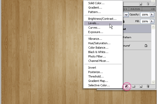
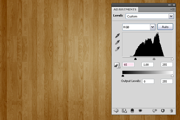
Click the
Create new fill or adjustment layer icon down the Layers panel, and choose
Levels.
Change the Shadows value to 65. And we're done with the Background.
Step 2
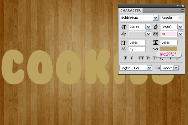
Create the text with the color
#c29f5f. The font used is
Bubblegum, and the size is 250 px. The
Tracking value (Window -> Character) is set to
10 to avoid stroke overlapping.
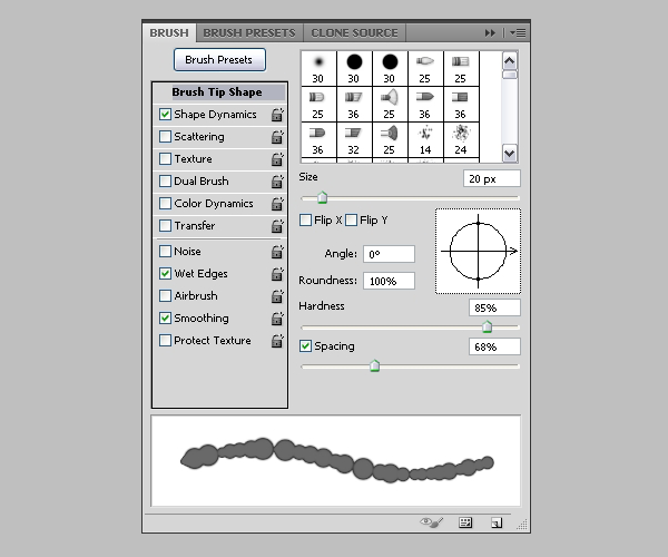
Now, we will modify some brush settings to create the stroke. So open the Brush panel (Window -> Brush), and choose a hard round brush. Under
Brush Tip Shape, set the Size to 20, the Hardness to 85%, and the Spacing to 68%.
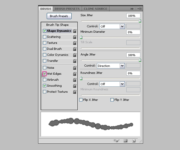
Under
Shape Dynamics, set the Size Jitter to 100%, and make sure the other values are as shown below. Also, check the
Wet Edges box down the Brush panel.
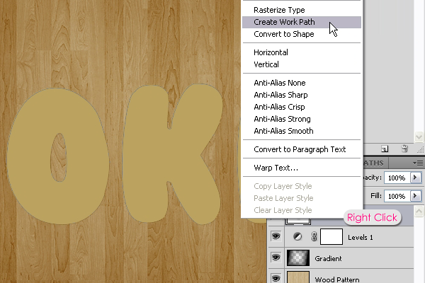
Back to the Layers panel, right click on the
text layer, and choose
Create Work Path.
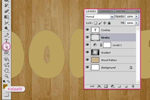
Create a new layer below the text layer and call it "Stroke". Set the Foreground color to
#a06600 and pick the
Direct Selection Tool.
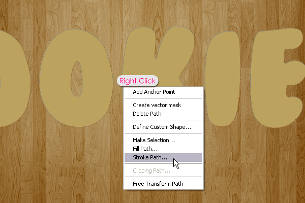
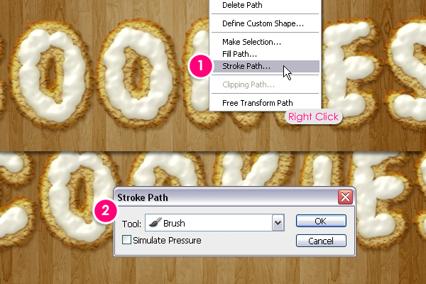
Right click on the path and choose
Stroke Path.
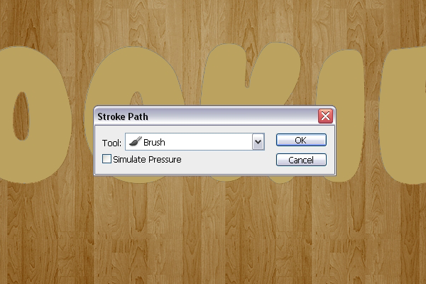
Choose
Brush from the Tool drop down menu, and un-check the
Simulater Pressure box.
This will create the cookies' stroke.
Step 3
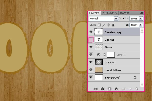
Duplicate the text layer and click the eye icon next to the
original text layer to remove it so that the layer content is invisible.
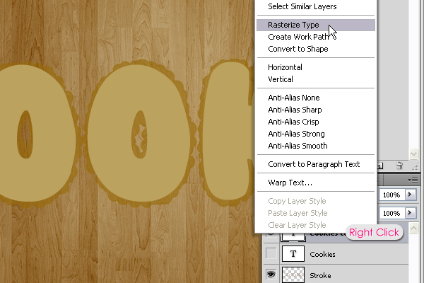
Right click on the
copy text layer and choose
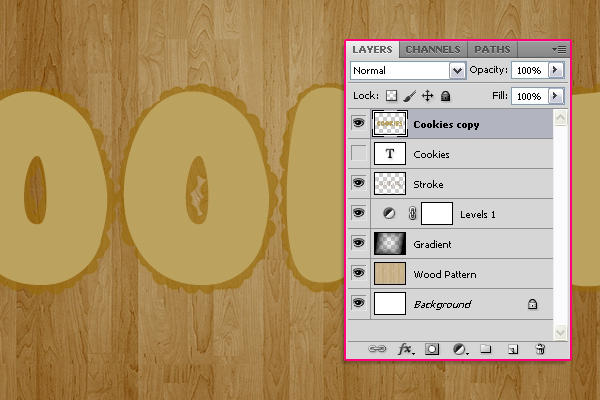
Rasterize Type.
The text layer will be rasterized, which means you can no longer modify the text, so make sure that you've done all the modifications needed bofre this step.
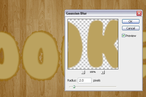
Go to
Filter -> Blur -> Gaussian Blur, and set the
Raduis to
2.
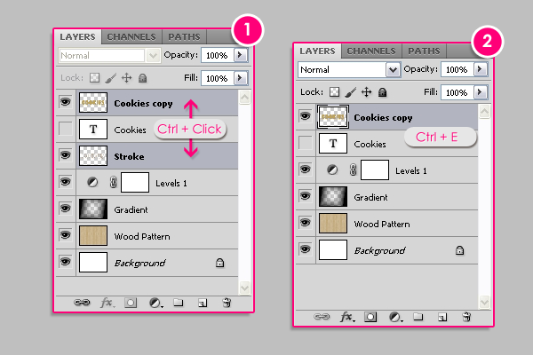
Press the Ctrl/Cmd key, and click on both the rasterized and the "Stroke" layers to select them. After that go to
Layer -> Merge Layers, (or press Ctrl/Cmd + E).
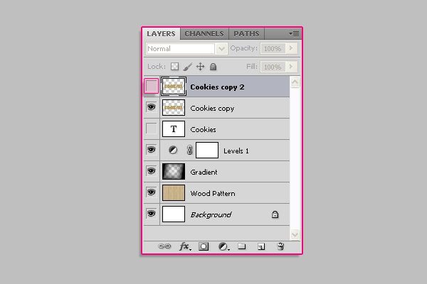
Duplicate the merged layer, and click the eye icon next to the
copy 2 layer to make it invisible.
Step 4
Double click on the original merged layer (
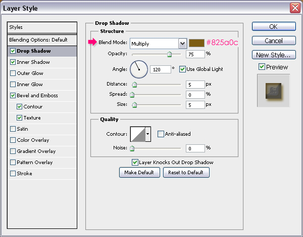
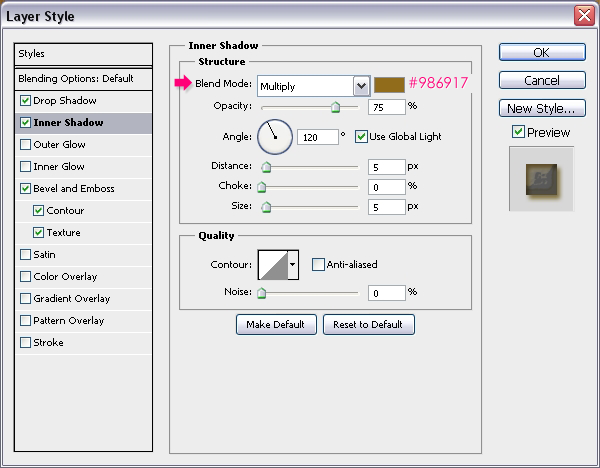
Cookies copy) to apply the following Layer Styles:
- Drop Shadow: Just change the color to #825a0c.
- Inner Shadow: Change the color to #986917.
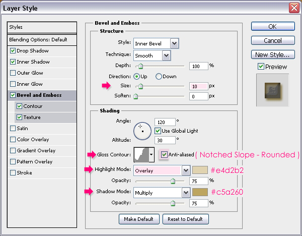
- Bevel and Emboss: Change the Size to 10, the Gloss Contour to Notched Slope - Rounded, and check the Anti-aliased box for a smoother effect. Also, change the Highlight Mode to Overlay, its color to #e4d2b2, and the Shadow Mode color to #c5a260.
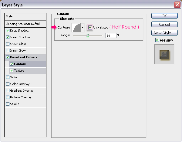
- Contour: Choose the Half Round contour, and check the Anti-aliased box.
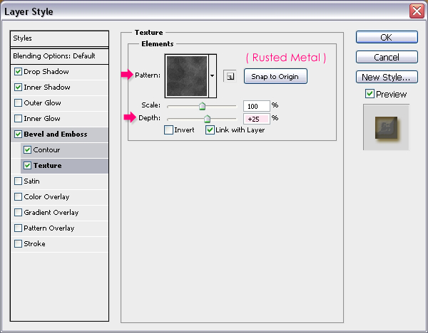
- Texture: Choose the Rusted Metal pattern, and change the Depth to 25%.
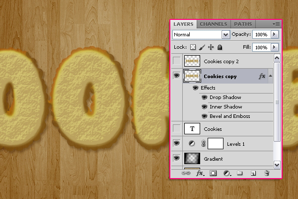
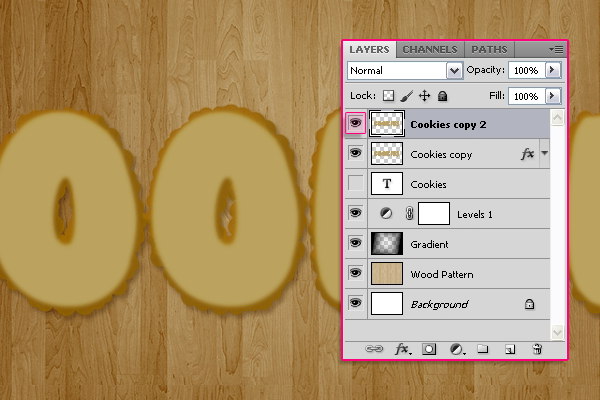
This is what the result should look like.
Step 5
Now click the empty box next to the
copy 2 layer so that the eye icon appears again, and the layer is visible.
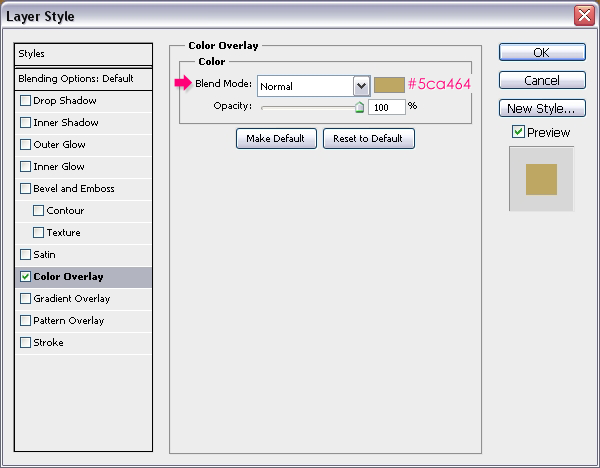
Double click the
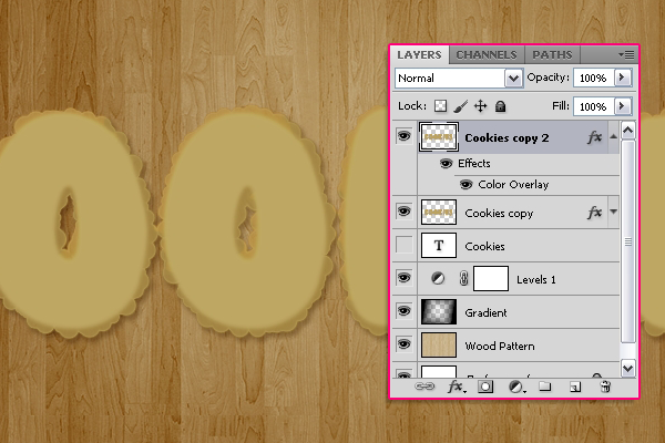
copy 2 layer to apply a
Color Overlay, and set the color to #c5a464.
This color will be the base for some Filters we are going to apply next.
Step 6
It's time to apply the Filters to enhance the texture we already have. But first, we are going to convert the
copy 2layer to a
Smart Object. This will apply the Filters to the Color Overlay instead of the original color, and will enable us to modify the Filters' values if needed later on.
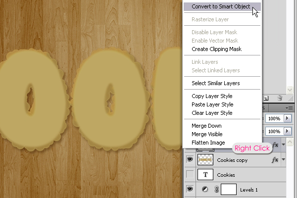
To do that, simply right click on the
copy 2 layer, and choose
Convert To Smart Object.
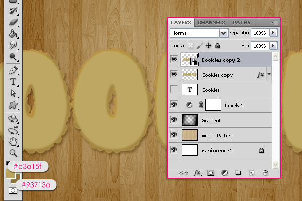
Set the Foreground color to
#c3a15f, and the Background color to
#93713a.
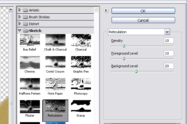
Go to
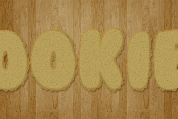
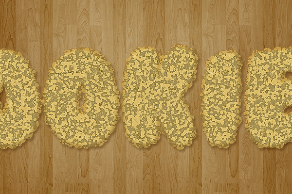
Filter -> Sketch -> Reticulation. Change the Density to 10, the Foreground Level to 10, and the Background Level to 20.
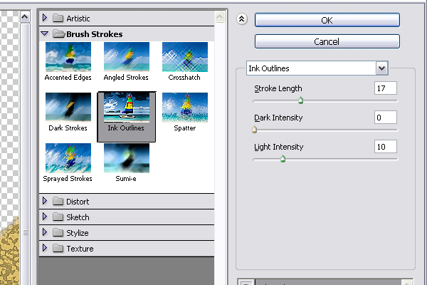
Next, go to
Filter -> Brush Strokes -> Ink Outlines. Change the Stroke Length to 17, the Dark Intensity to 0, and the Light Intensity to 10.
Finally, go to
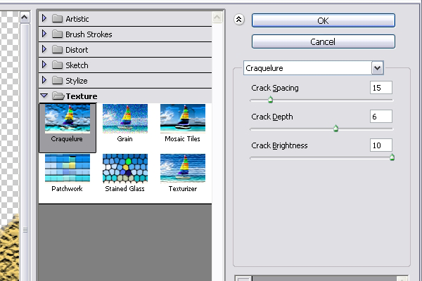
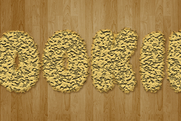
Filter -> Texture -> Craquelure. Set the Crack Spacing to 15, the Crack Depth to 6, and the Crakc Brightness to 10.
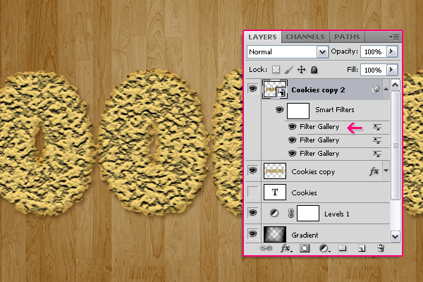
That's it for the Filters. If you want to play around with the values you can do that by double clicking on the "Filter Gallery" to get into the Filter's dialog box. Make sure to do any modifications before you move to the next step, because we are going to rasterize this layer.
Step 7
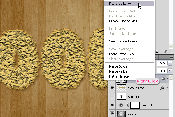
Righ click on the
copy 2 layer and choose
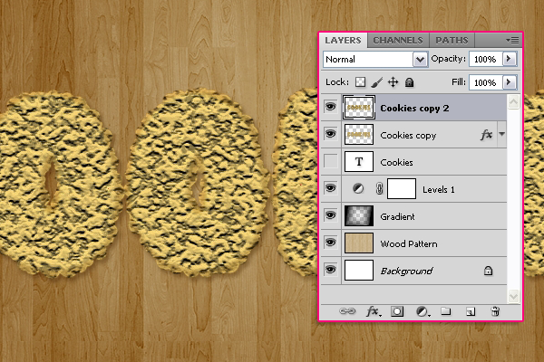
Rasterize Layer..
The layer is no longer a Smart Object now.
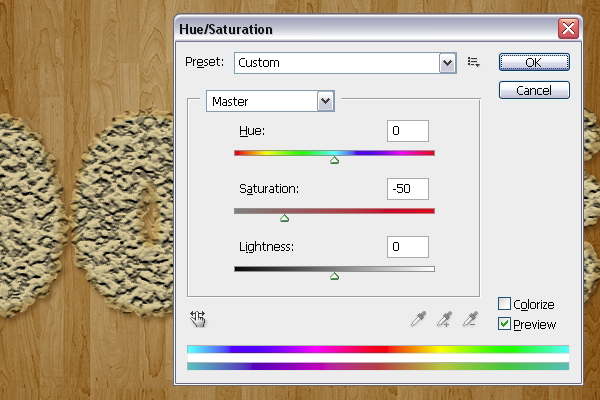
Go to
Image -> Adjustments -> Hue/Saturation, (or press Ctrl/Cmd + U), and change the Saturation value to -50.
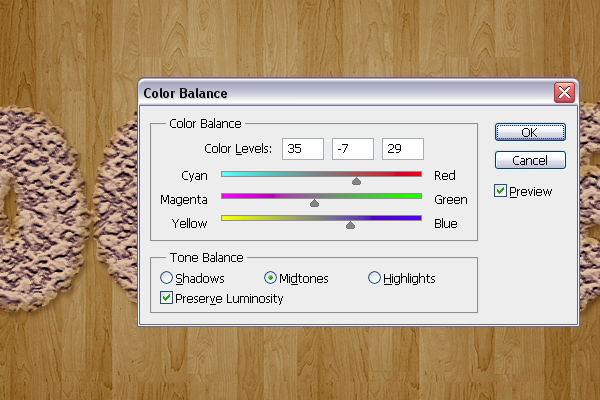
Go to
Image -> Adjustments -> Color Balance, (or press Ctrl/Cmd + B), and for the Midtones, change the Color Levels values to 35, -7, and 29.
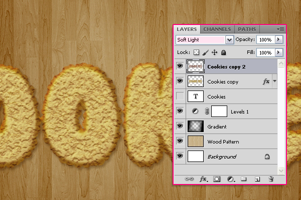
Change the
copy 2 layer's
Blend Mode to
Soft Light.This will give a nice red tone to the texture.
Step 8
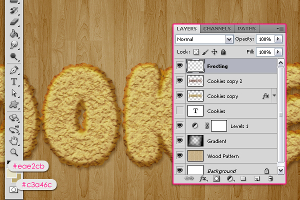
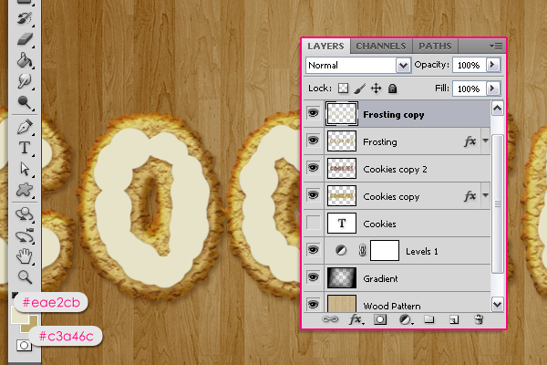
Create a new layer on top of all layers and call it "Frosting". Then, set the Foreground color to
#eae2cb and the Background color to
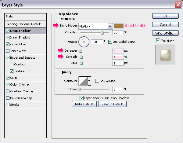
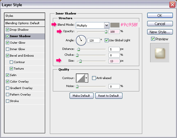
#c3a46c. We are going to apply the Layer Styles for this layer before drawing the frosting, as this will make the drawing process easier and more precise. So double click the "Frosting" layer to apply the following Layer Styles.
- Drop Shadow: Change the color to #ad7b40, the Distance to 3, and the Spread to 5.
- Inner Shadow: Change the color to #9c958f, the Opacity to 100%, and the Size to 13.
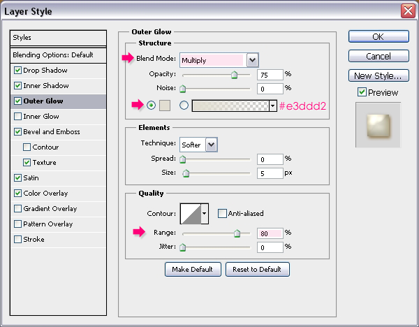
- Outer Glow: Change the Blend Mode to Multiply, the color to #e3ddd2, and the Rnage to 80%.
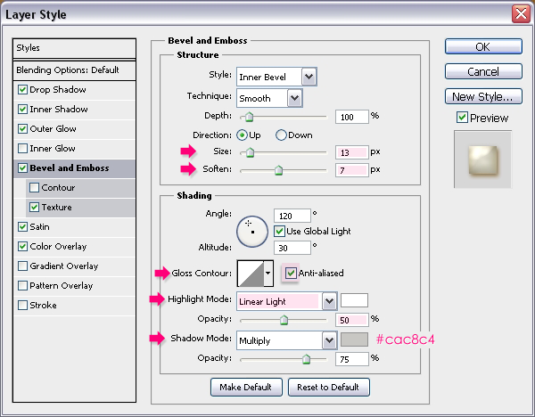
- Bevel and Emboss: Change the Size to 13, the Soften to 7, check the Anti-aliased box, change the Highlight Mode to Linear Light and its Opacity to 50%, and change the Shadow Mode color to #cac8c4.
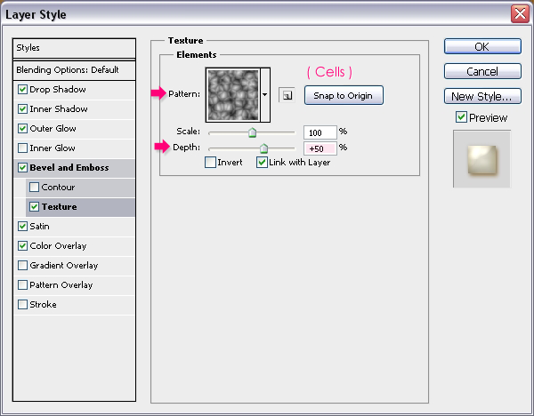
- Texture: Choose the Cells pattern, and change the Depth to 50.
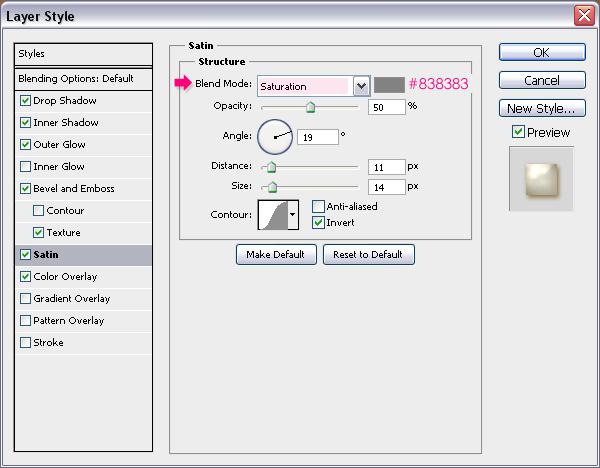
- Satin: Change the Blend Mode to Saturation and the color to #838383.
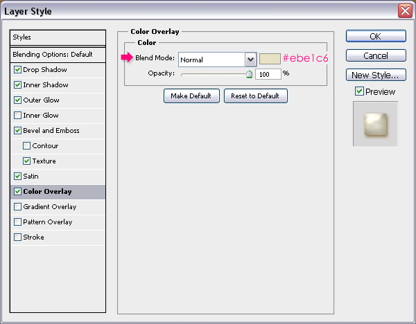
- Color Overlay: Set the color to #ebe1c6.
Step 9
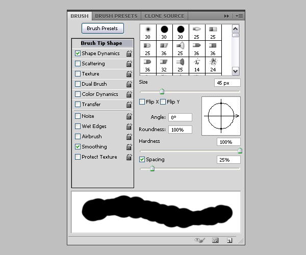
After the Layer Styles are applied, we are going to modify the frosting brush. Open the Brush panel again (Window -> Brush), choose a hard round brush, and under
Brush Tip Shape set the Size to 45, the Hardness to 100%, and the Spacing to 25%.
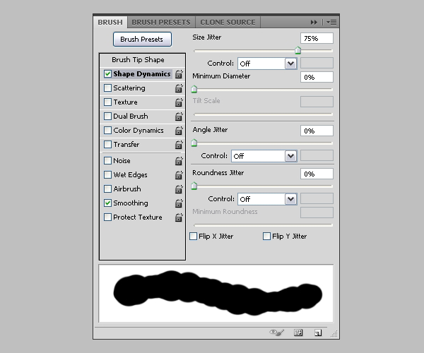
Under
Shape Dynamics, set the Size Jitter to 75%, and make sure other values are set to 0.
With the "Frosting" layer selected (active), start adding the frosting. Try moving slow and fast to see how the brush works in both cases. Because the Layer Styles are already applied, you'll notice that the brush flows smoothly, kinda' like a real frosting does!
Keep in mind that you can change the size of the brush, undo and redo, add or remove parts from different areas. Take your time with this step, we want the cookies to look as delicious as possible!
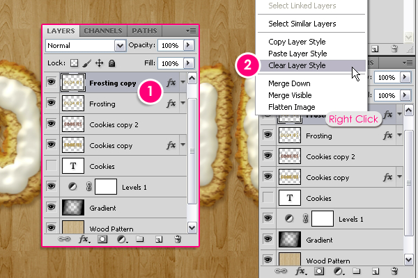
Once you're done adding the frosting, duplicate the "Frosting" layer, then right click on the
copy and choose
Clear Layer Style.
Make sure that the Foreground and Background colors are still set to
#eae2cb and
#c3a46c.
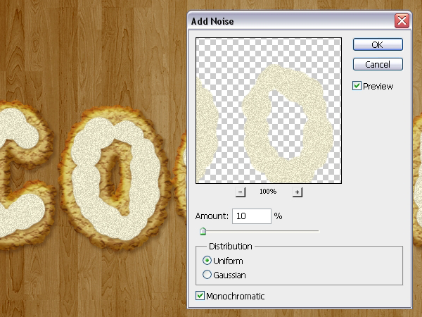
Go to
Filter -> Noise -> Add Noise, and set the Amount to 10, the Distribution to Uniform, and check the Monochromatic box.
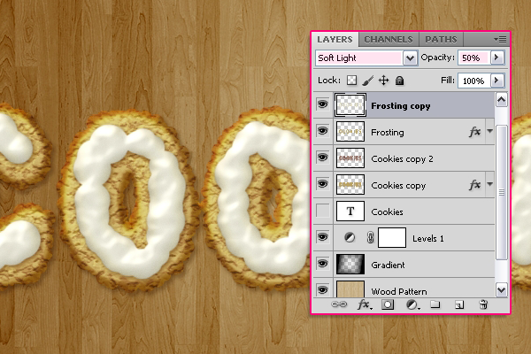
Change the "Frosting copy" layer's
Blend Mode to
Soft Light and its
Opacity to
50%. This will enhance the frosting color and give it a nice shine.
We're done with the text effect. Next, we are going to create the rack.
Step 10
Create a new 42 x 1 px document with a Transparent Background.
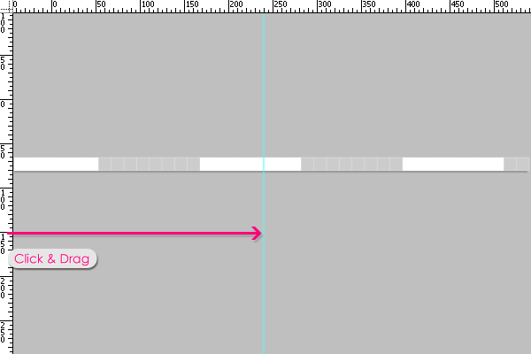
Press Ctrl/Cmd + R to show the Ruler. Click and drag a guide from the vertical ruler, and place it in the center of the document. (Check the Snap option under the View menu so that the guide will snap to the center of the document when you drag it).
This is optional, but it can be a bit helpful. Go to
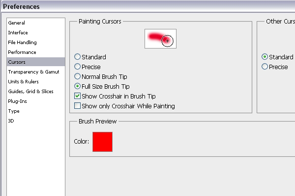
Edit -> Preferences -> Cursors, and check the
Show Crosshair in Brush Tip box.
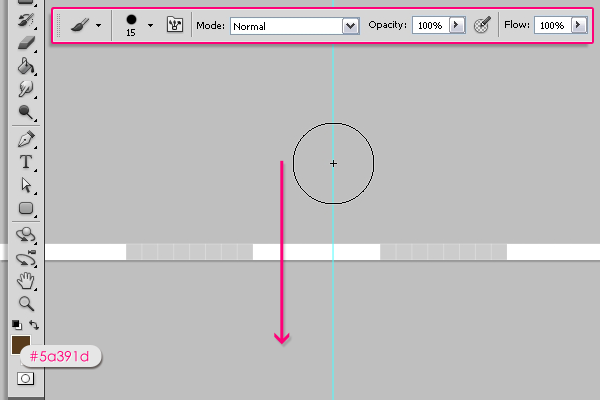
Back to the document, (you can zoom in to make things clearer), choose a round hard brush, set its size to 15, and set the Foreground color to
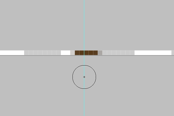
#5a391d. Place the center of the brush on the guide outside the document from the top, press and hold the Shift key, then drag the brush to the bottom.
The reason why a brush is used instead of a fill is that it gives a smoother result.
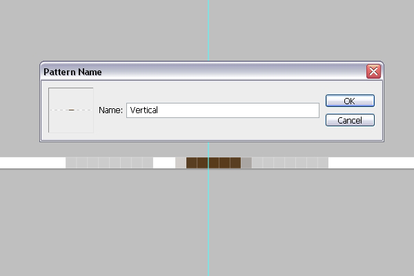
Go to
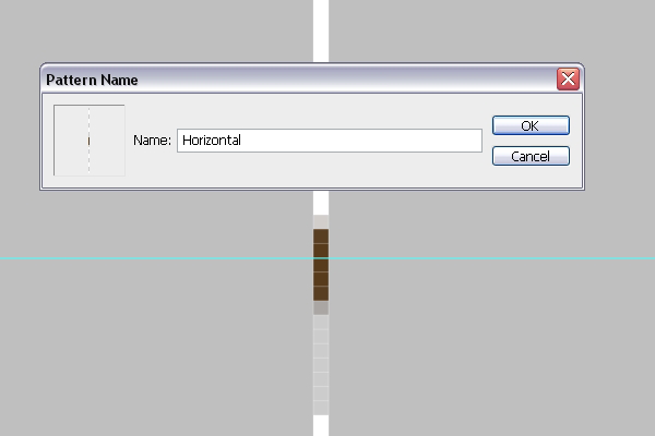
Edit -> Define Pattern, and type in
Vertical.
Go to
Image ->Image Rotation -> 90° CW, then, once again
Edit -> Define Pattern, and type in
Horizontal this time.
Step 11
Back to the original document, create a new layer right on top of the
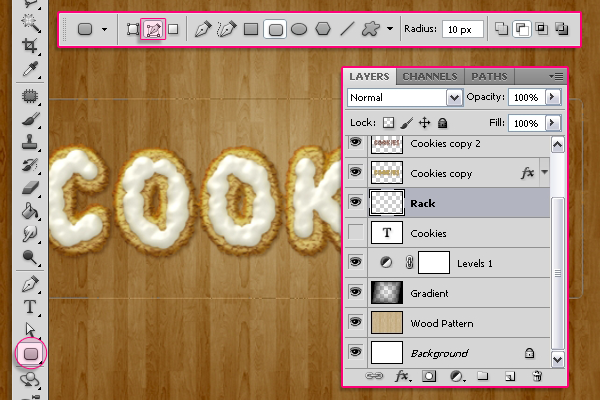
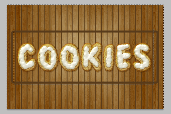
original text layer, and call it "Rack". Pick the
Rounded Rectangle Tool, click the
Paths icon in the Options Bar, and type in 10 for the Raduis value. Draw a round rectangle path around the text.
With the Foreground color still set to
#5a391d, stroke the path just like you did back in Step 2 (Right click -> Stroke Path, choose Brush and un-check the Simulate Pressure box).
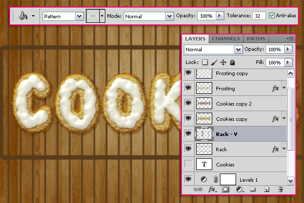
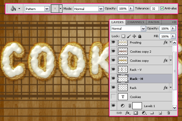
Create a new layer on top of the "Rack" layer and call it "Rack - V". Pick the
Paint Bucket Tool, and choose the
Vertical pattern to fill the document.
Using the
Rectangular Marquee Tool, draw a rectangular selection around the area you want to keep. Make sure that all the lines are inside the rack's base, nothing outside it or intersecting with it from the left and right sides, but leave some extra (10 - 15 px) parts at the top and the bottom. We will need those later on to create the shadow.
Go to
Select -> Inverse, and hit Delete to get rid of the unwanted lines..
Create a new layer below the "Rack - V" layer and call it "Rack - H". Fill it with the
Horizontal pattern. You can move the pattern around if you want to change its position.
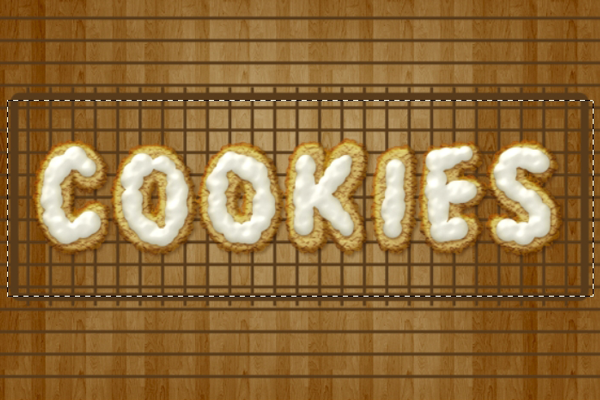
Once again, use the
Rectangular Marquee Tool to select the parts you want to keep. This time, leave the extra parts on the right and left sides of the rack.
This is what you should get.
Step 12
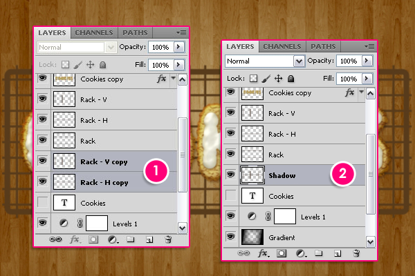
Press the Ctrl/Cmd key, and click on the "Rack - V" and "Rack - H" layers to select them, then duplicate them and drag them so that they are below the original layers. Press Ctrl/Cmd + E to merge the
copy layers, and rename the merged layer to "Shadow".
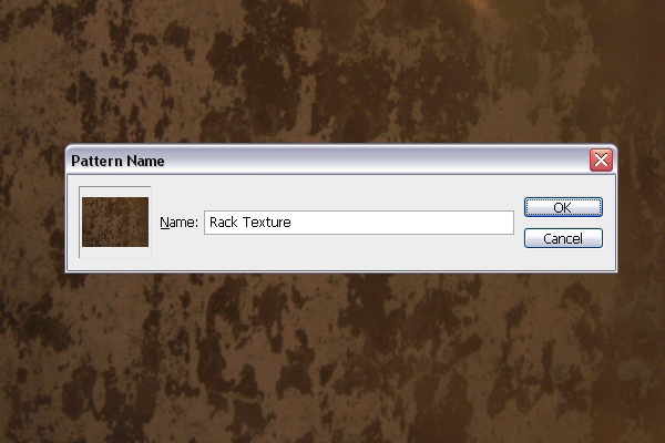
Open the Rusty
Texture image, then go to
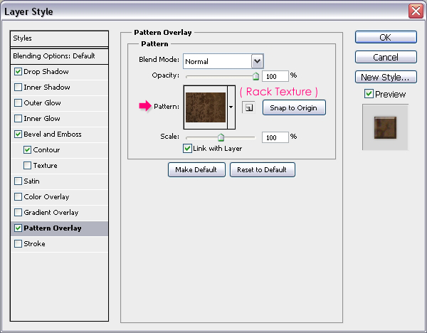
Edit -> Define Pattern and type in "Rack Texture" for the Name.
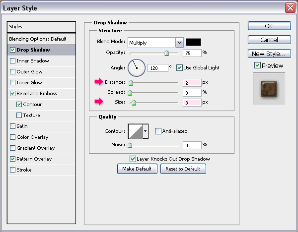
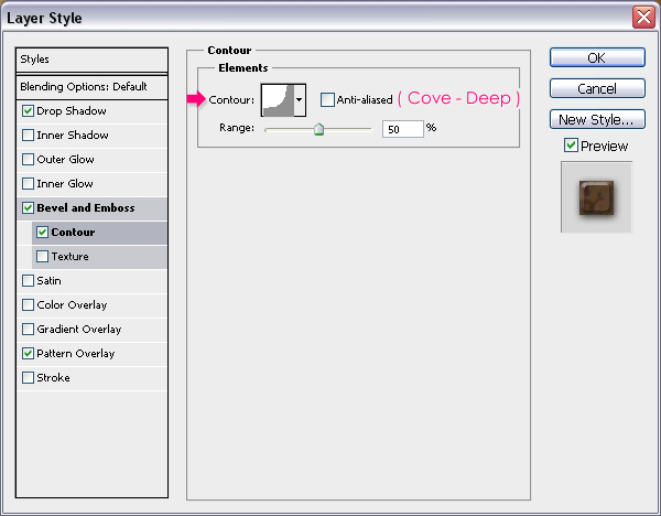
Double click on the "Rack" layer to apply the following Styles:
- Drop Shadow: Change the Distance to 2 and the Size to 8.
- Bevel and Emboss: Change the Size to 7, the Highlight Mode color to #bfbfbf, and the Shadow Mode color to #797979.
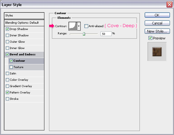
- Contour: Choose the Cove - Deep contour.
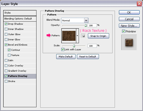
- Pattern Overlay: Choose the "Rack Pattern".
This should give the Rack a nice beveled and textured look.
Step 13
Double click the "Rack - H" layer to apply the following Styles:
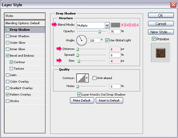
- Drop Shadow: Change the color to #848484, the Distance to 0 and the Size to 4.
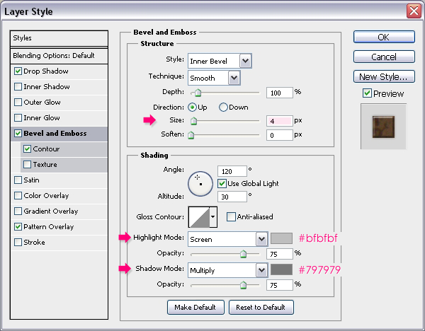
- Bevel and Emboss: Change the Size to 4, the Highlight Mode color to #bfbfbf, and the Shadow Mode color to #797979.
- Contour: Choose the Cove - Deep contour.
- Pattern Overlay: Choose the "Rack Pattern".
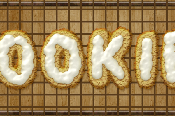
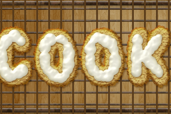
This is what you should get.
Apply the same Layer Styles to the "Rack - V" layer. (Right click on the "Rack - H" layer, choose Copy Layer Style, then right click on the "Rack - V" layer, and choose Paste Layer Style).
Step 14
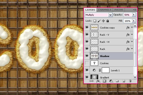
Select the "Shadow" layer, change its
Blend Mode to
Multiply and it
Opacity to
50%. With the
Move Toolactive, use the Arrow keys to move the shadow around (to the left and downwards). The extra parts we left will ensure that no empty areas appear when the shadow is moved.
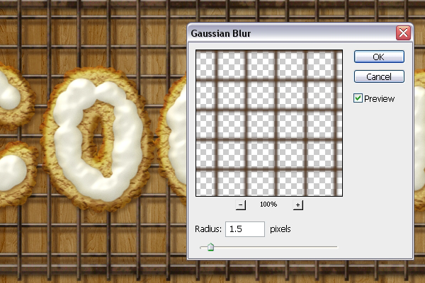
Go to
Filter -> Blur -> Gaussian Blur and set the Radius to 1.5.
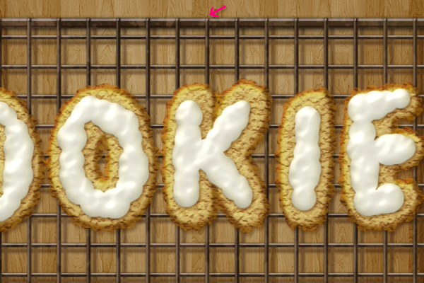
Once you're done moving the shadow, use the
Ractagular Marquee Tool to select and delete the extra parts from the "Rack - V", "Rack - H", and "Shadow" layers.
Step 15
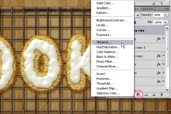
The last thing we are going to do is toning down the colors, so this is optional. Click the
Create new fill or adjustment layer icon and choose
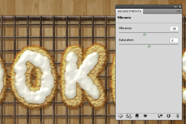
Vibrance.
Set the Vibrance value to -15.
Note: If the colors you get still look so red and vibrant, this might be caused by the color settings you have in Photoshop. To fix this, click the "Create new fill or adjustment layer" icon again, and choose Color Balance. With the Midtones option checked, change the Color Levels to -17, +4, -4.
And that's it! Hope you enjoyed this tutorial and found it useful. Will be glad to know your thoughts and read your comments.
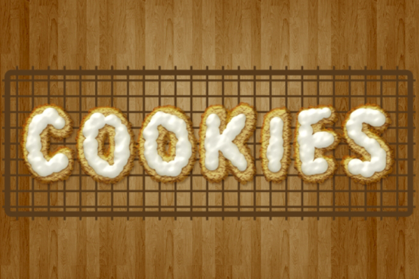
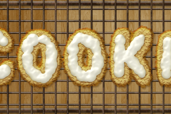
Final Result






![final-results[1] final-results[1]](http://photoshoptutorials.ws/images/stories/b4ba78947634_FA1/final-results1.png)
Keine Kommentare:
Kommentar veröffentlichen